EPFL · Data Visualization (COM-480)
EuroBnB Insights
EuroBnB Insights is a web dashboard built with two teammates for EPFL's Data Visualization course (COM-480). It asks how short-term-rental dynamics differ and converge across ten flagship cities (Amsterdam, Athens, Barcelona, Berlin, Budapest, Lisbon, London, Paris, Rome, Vienna), using data split into weekday and weekend snapshots to trace how a neighbourhood flips from business-travel zone to holiday hotspot in two days.
My part covered the data preprocessing, the maps and the radar charts. Preprocessing was a three-step pipeline applied uniformly to every city: drop unusable rows (duplicates, missing coordinates, price outliers), spatially join each listing to its official district polygon to add a district field, and rescale the restaurant- and attraction-density scores to a common 0-10 range so cities are visually comparable. Standardizing the schema early let every chart join across cities without extra code.
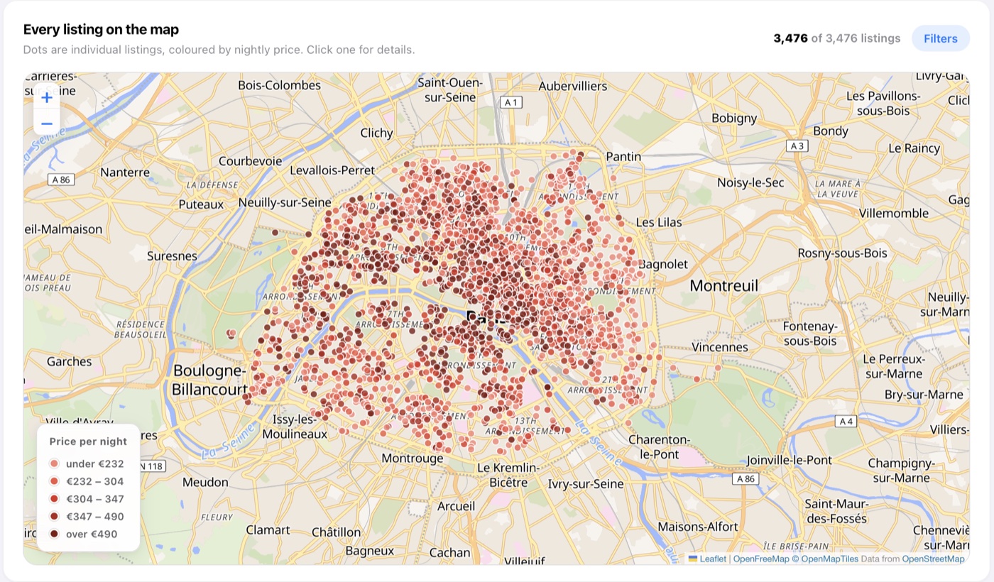
The interactive maps use Leaflet over Mapbox tiles to place every listing, colour-coded by nightly price with district-level GeoJSON boundaries, while the radar charts compare cities and room types across price, cleanliness and amenity axes on normalized scales. D3.js scatter plots let a user test hypotheses directly, such as whether proximity to the metro or Superhost status commands a price premium.